Chapter 2: Summarizing and Graphing Data
|
|
|
- MargaretMargaret Woods
- 5 years ago
- Views:
Transcription
1 Chapter 2: Summarizing and Graphing Data 9 Chapter 2: Summarizing and Graphing Data Section No. For each class, the frequency tells us how many values fall within the given range of values, but there is no way to determine the exact IQ scores represented in the class. 2. If percentages are used, the sum should be 100%. If proportions are used, the sum should be No. The sum of the percentages is 199% not 100%, so each respondent could answer yes to more than one category. The table does not show the distribution of a data set among all of several different categories. Instead, it shows responses to five separate questions. 4. The gap in the frequencies suggests that the table includes heights of two different populations: students and faculty/staff. 5. Class width: 10. Class midpoints: 24.5, 34.5, 44.5, 54.5, 64.5, 74.5, Class boundaries: 19.5, 29.5, 39.5, 49.5, 59.5, 69.5, 79.5, Class width: 10. Class midpoints: 24.5, 34.5, 44.5, 54.5, 64.5, Class boundaries: 19.5, 29.5, 39.5, 49.5, 59.5, 69.5, Class width: 10. Class midpoints: 54.5, 64.5, 74.5, 84.5, 94.5, 104.5, 114.5, Class boundaries: 49.5, 59.5, 69.5, 79.5, 89.5, 99.5, 109.5, 119.5, Class width: 5. Class midpoints: 2, 7, 12, 17, 22, 27, 32, 37. Class boundaries: 0.5, 4.5, 9.5, 14.5, 19.5, 24.5, 29.5, 34.5, Class width: 2. Class midpoints: 3.95, 5.95, 7.95, 9.95, Class boundaries: 2.95, 4.95, 6.95, 8.95, 10.95, Class width: 2. Class midpoints: 3.95, 5.95, 7.95, 9.95, Class boundaries: 2.95, 4.95, 6.95, 8.95, 10.95, 12.95, No. The frequencies do not satisfy the requirement of being roughly symmetric about the maximum frequency of Yes. The frequencies start low, increase to the maximum frequency of 43, and then decrease. Also, the frequencies are approximately symmetric about the maximum frequency of , 7, , 12, 6, 2
2 10 Essentials of Statistics, 5th edition 15. On average, the actresses appear to be younger than the actors. Age When Oscar Was Won Relative Frequency (Actresses) Relative Frequency (Actors) % 1.2% % 31.7% % 42.7% % 15.9% % 7.3% % 1.2% % 0.0% 16. The differences are not substantial. Based on the given data, males and females appear to have about the same distribution of white blood cell counts. White Blood Cell Counts Relative Frequency (Males) Relative Frequency (Females) % 15.0% % 40.0% % 22.5% % 17.5% % 0.0% % 5.0% 17. The cumulative frequency table is Age (years) of Best Actress When Oscar Was Won 18. The cumulative frequency table is Cumulative Frequency Less than Less than Less than Less than Less than Less than Less than Age (years) of Best Actor When Oscar Was Won Cumulative Frequency Less than 30 1 Less than Less than Less than Less than Less than 80 82
3 Chapter 2: Summarizing and Graphing Data Because there are disproportionately more 0s and 5s, it appears that the heights were reported instead of measured. Consequently, it is likely that the results are not very accurate. x Frequency Because there are disproportionately more 0s and 5s, it appears that the heights were reported instead of measured. Consequently, it is likely that the results are not very accurate. x Frequency Yes, the distribution appears to be a normal distribution. Pulse Rate (Male) Frequency
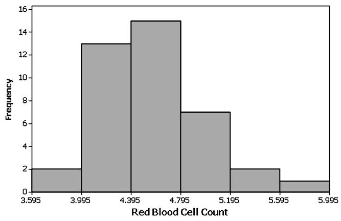
4 12 Essentials of Statistics, 5th edition 22. Yes. The pulse rates of males appear to be generally lower than the pulse rates of females. Pulse Rate (Females) Frequency No, the distribution does not appear to be a normal distribution. Magnitude Frequency No, the distribution does not appear to be a normal distribution. Depth (km) Frequency Yes, the distribution appears to be roughly a normal distribution. Red Blood Cell Count Frequency Yes, the distribution appears to be roughly a normal distribution. Red Blood Cell Count Frequency
5 Chapter 2: Summarizing and Graphing Data Yes. Among the 48 flights, 36 arrived on time or early, and 45 of the flights arrived no more than 30 minutes late. Arrival Delay (min) Frequency ( 60) ( 31) 11 ( 30) ( 1) No. The times vary from a low of 12 minutes to a high of 49 minutes. It appears that many flights taxi out quickly, but many other flights require much longer times, so it would be difficult to predict the taxi-out time with reasonable accuracy Taxi-Out Time (min) Frequency Category Relative Frequency Male Survivors 16.2% Males Who Died 62.8% Female Survivors 15.5% Females Who Died 5.5% Cause Relative Frequency Bad Track 46% Faulty Equipment 18% Human Error 24% Other 12% 31. Pilot error is the most serious threat to aviation safety. Better training and stricter pilot requirements can improve aviation safety. Cause Relative Frequency Pilot Error 50.5% Other Human Error 6.1% Weather 12.1% Mechanical 22.2% Sabotage 9.1%
6 14 Essentials of Statistics, 5th edition 32. The digit 0 appears to have occurred with a higher frequency than expected, but in general the differences are not very substantial, so the selection process appears to be functioning correctly. The digits are qualitative data because they do not represent measures or counts of anything. The digits could be replaced by the first 10 letters of the alphabet, and the lottery would be essentially the same. Digit Relative Frequency % 1 8.3% % % 4 6.7% 5 9.2% 6 7.5% 7 8.3% 8 7.5% % 33. An outlier can dramatically affect the frequency table. Weight (lb) With Outlier Without Outlier Number of Data Values Ideal Number of Classes

7 Section 2-3 Chapter 2: Summarizing and Graphing Data It is easier to see the distribution of the data by examining the graph of the histogram than by the numbers in the frequency distribution. 2. Not necessarily. Because those with special interests are more likely to respond, and the voluntary response sample is likely to consist of a group having characteristics that are fundamentally different than those of the population. 3. With a data set that is so small, the true nature of the distribution cannot be seen with a histogram. The data set has an outlier of 1 minute. That duration time corresponds to the last flight, which ended in an explosion that killed seven crew members. 4. When referring to a normal distribution, the term normal has a meaning that is different from its meaning in ordinary language. A normal distribution is characterized by a histogram that is approximately bell-shaped. Determination of whether a histogram is approximately bell-shaped does require subjective judgment. 5. Identifying the exact value is not easy, but answers not too far from 200 are good answers. 6. Class width of 2 inches. Approximate lower limit of first class of 43 inches. Approximate upper limit of first class of 45 inches. 7. The tallest person is about 108 inches, or about 9 feet tall. That tallest height is depicted in the bar that is farthest to the right in the histogram. That height is an outlier because it is very far from all of the other heights. The height of 9 feet must be an error, because the height of the tallest human ever recorded was 8 feet 11 inches. 8. The first group appears to be adults. Knowing that the people entered a museum on a Friday morning, we can reasonably assume that there were many school children on a field trip and that they were accompanied by a smaller group of teachers and adult chaperones and other adults visiting the museum by themselves. 9. The digits 0 and 5 seem to occur much more than the other digits, so it appears that the heights were reported and not actually measured. This suggests that the results might not be very accurate. 10. The digits 0 and 5 seem to occur much more often than the other digits, so it appears that the heights were reported and not measured. This suggests that the results might not be very accurate. 11. The histogram does appear to depict a normal distribution. The frequencies increase to a maximum and then tend to decrease, and the histogram is symmetric with the left half being roughly a mirror image of the right half.


8 16 Essentials of Statistics, 5th edition 11. (continued) 12. The histogram appears to roughly approximate a normal distribution. The frequencies generally increase to a maximum and then tend to decrease, and the histogram is symmetric with the left half being roughly a mirror image of the right half. 13. The histogram appears to roughly approximate a normal distribution. The frequencies increase to a maximum and then tend to decrease, and the histogram is symmetric with the left half being roughly a mirror image of the right half. 14. No, the histogram does not appear to approximate a normal distribution. The frequencies do not increase to a maximum and then decrease, and the histogram is not symmetric with the left half being a mirror image of the right half.


9 Chapter 2: Summarizing and Graphing Data (continued) 15. The histogram appears to roughly approximate a normal distribution. The frequencies increase to a maximum and then tend to decrease, and the histogram is symmetric with the left half being roughly a mirror image of the right half. 16. The histogram appears to roughly approximate a normal distribution. The frequencies increase to a maximum and then tend to decrease, and the histogram is symmetric with the left half being roughly a mirror image of the right half.


10 18 Essentials of Statistics, 5th edition 17. The two leftmost bars depict flights that arrived early, and the other bars to the right depict flights that arrived late. 18. Yes, the entire distribution would be more concentrated with less spread. 19. The ages of actresses are lower than those of actors. 20. a. 107 inches to 109 inches; 8 feet 11 inches to 9 feet 1 inch. b. The heights of the bars represent numbers of people, not heights. Because there are many more people between 43 inches tall and 55 inches tall, they have the tallest bars in the histogram, but they have the lowest actual heights. They have the tallest bars because there are more of them. Section In a Pareto chart, the bars are arranged in descending order according to frequencies. The Pareto chart helps us understand data by drawing attention to the more important categories, which have the highest frequencies.
11 Chapter 2: Summarizing and Graphing Data A scatter plot is a plot of paired quantitative data, and each pair of data is plotted as a single point. The scatterplot requires paired quantitative data. The configuration of the plotted points can help us determine whether there is some relationship between two variables. 3. The data set is too small for a graph to reveal important characteristics of the data. With such a small data set, it would be better to simply list the data or place them in a table. 4. The sample is a voluntary response sample since the students report their scores to the website. Because the sample is a voluntary response sample, it is very possible that it is not representative of the population, even if the sample is very large. Any graph based on the voluntary response sample would have a high chance of showing characteristics that are not actual characteristics of the population. 5. Because the points are scattered throughout with no obvious pattern, there does not appear to be a correlation. 6. The configuration of the points does not support the hypothesis that people with larger brains have larger IQ scores.
12 20 Essentials of Statistics, 5th edition 7. Yes. There is a very distinct pattern showing that bears with larger chest sizes tend to weigh more. 8. Yes. There is a very distinct pattern showing that cans of Coke with larger volumes tend to weigh more. Another notable feature of the scatterplot is that there are five groups of points that are stacked above each other. This is due to the fact that the measured volumes were rounded to one decimal place, so the different volume amounts are often duplicated, with the result that points are stacked vertically. 9. The first amount is highest for the opening day, when many Harry Potter fans are most eager to see the movie; the third and fourth values are from the first Friday and the first Saturday, which are the popular weekend days when movie attendance tends to spike.
13 Chapter 2: Summarizing and Graphing Data The numbers of home runs rose from 1990 to 2000, but after 2000 there was a very gradual decline. 11. Yes, because the configuration of the points is roughly a bell shape, the volumes appear to be from a normally distributed population. The volume of 11.8 oz. appears to be an outlier. 12. No, because the configuration of points is not at all a bell shape, the amounts do not appear to be from a normally distributed population. 13. No. The distribution is not dramatically far from being a normal distribution with a bell shape, so there is not strong evidence against a normal distribution There are no outliers. The distribution is not dramatically far from being a normally distribution with a bell shape, so there is not strong evidence against a normal distribution


14 22 Essentials of Statistics, 5th edition To remain competitive in the world, the United States should require more weekly instruction time Because there is not a single total number of hours of instruction time that is partitioned among the five countries, it does not make sense to use a pie chart for the given data.
15 Chapter 2: Summarizing and Graphing Data The frequency polygon appears to roughly approximate a normal distribution. The frequencies increase to a maximum and then tend to decease, and the graph is symmetric with the left half being roughly a mirror image of the right half. 20. No, the frequency polygon does not appear to approximate a normal distribution. The frequencies do not increase to a maximum and then decrease, and the graph is not symmetric with the left half being a mirror image of the right half. 21. The vertical scale does not start at 0, so the difference is exaggerated. The graphs make it appear that Obama got about twice as many votes as McCain, but Obama actually got about 69 million votes compared to 60 million to McCain. 22. The fare doubled from $1 to $2, but when the $2 bill is shown with twice the width and twice the height of the $1 bill, the $2 bill has an area that is four times that of the $1 bill, so the illustration greatly exaggerates the increase in fare. 23. China s oil consumption is 2.7 times (or roughly 3 times) that of the United States, but by using a larger barrel that is three times as wide and three times as tall (and also three times as deep) as the smaller barrel, the illustration has made it appear that the larger barrel has a volume that is 27 times that of the smaller barrel. The actual ratio of US consumption to China s consumption is roughly 3 to 1, but the illustration makes it appear to be 27 to The actual braking distances are 133 ft., 136 ft., and 143 ft., so the differences are relatively small, but the illustration has a scale that begins at 130 ft., so the differences are grossly exaggerated.
16 24 Essentials of Statistics, 5th edition 25. The ages of actresses are lower than those of actors. 26. a b. The condensed stemplot reduces the number of rows so that the stemplot is not too large to be understandable * * * * * * * * 3 Chapter Quick Quiz 1. The class width is The class boundaries are and No min., 62 min., 62 min., 62 min., 62 min., 67 min., and 69 min. 6. Bar graph 7. Scatterplot 8. Pareto Chart 9. The distribution of the data set 5. No 10. The bars of the histogram start relatively low, increase to a maximum value and then decrease. Also, the histogram is symmetric with the left half being roughly a mirror image of the right half. Review Exercises 1. Volume (cm 3 ) Frequency

17 Chapter 2: Summarizing and Graphing Data No, the distribution does not appear to be normal because the graph is not symmetric. 3. Although there are differences among the frequencies of the digits, the differences are not too extreme given the relatively small sample size, so the lottery appears to be fair. 4. The sample size is not large enough to reveal the true nature of the distribution of IQ scores for the population from which the sample is obtained A time-series graph is best. It suggests that the amounts of carbon monoxide emissions in the United States are increasing.
18 26 Essentials of Statistics, 5th edition 6. A scatterplot is best. The scatterplot does not suggest that there is a relationship. 7. A Pareto chart is best. Cumulative Review Exercises 1. Pareto chart. 2. Nominal, because the responses consist of names only. The responses do not measure or count anything, and they cannot be arranged in order according to some quantitative scale. 3. Voluntary response sample. The voluntary response sample is not likely to be representative of the population, because those with special interests or strong feelings about the topic are more likely than others to respond and their views might be very different from those of the general population. 4. By using a vertical scale that does not begin at 0, the graph exaggerates the differences in the numbers of responses. The graph could be modified by starting the vertical scale at 0 instead of The percentage is 241 = = 37.6%. Because the percentage is based on a sample and not a population 641 that percentage is a statistic. 6. Grooming Time (min.) Frequency

19 Chapter 2: Summarizing and Graphing Data Because the frequencies increase to a maximum and then decrease and the left half of the histogram is roughly a mirror image of the right half, the data appear to be from a population with a normal distribution. 8. Stemplot
20
Sampling, Frequency Distributions, and Graphs (12.1)
") 1 Sampling, Frequency Distributions, and Graphs (1.1) Design: Plan how to obtain the data. What are typical Statistical Methods? Collect the data, which is then subjected to statistical analysis, which
1 Sampling, Frequency Distributions, and Graphs (1.1) Design: Plan how to obtain the data. What are typical Statistical Methods? Collect the data, which is then subjected to statistical analysis, which
Review for Exam #1. Chapter 1. The Nature of Data. Definitions. Population. Sample. Quantitative data. Qualitative (attribute) data
 data") Review for Exam #1 1 Chapter 1 Population the complete collection of elements (scores, people, measurements, etc.) to be studied Sample a subcollection of elements drawn from a population 11 The Nature
Review for Exam #1 1 Chapter 1 Population the complete collection of elements (scores, people, measurements, etc.) to be studied Sample a subcollection of elements drawn from a population 11 The Nature
AP Final Review II Exploring Data (20% 30%)
") AP Final Review II Exploring Data (20% 30%) Quantitative vs Categorical Variables Quantitative variables are numerical values for which arithmetic operations such as means make sense. It is usually a measure
AP Final Review II Exploring Data (20% 30%) Quantitative vs Categorical Variables Quantitative variables are numerical values for which arithmetic operations such as means make sense. It is usually a measure
Units. Exploratory Data Analysis. Variables. Student Data
 Units Exploratory Data Analysis Bret Larget Departments of Botany and of Statistics University of Wisconsin Madison Statistics 371 13th September 2005 A unit is an object that can be measured, such as
Section 3.2 Measures of Central Tendency
 Section 3.2 Measures of Central Tendency 1 of 149 Section 3.2 Objectives Determine the mean, median, and mode of a population and of a sample Determine the weighted mean of a data set and the mean of a
Math 223 Lecture Notes 3/15/04 From The Basic Practice of Statistics, bymoore
 Math 223 Lecture Notes 3/15/04 From The Basic Practice of Statistics, bymoore Chapter 3 continued Describing distributions with numbers Measuring spread of data: Quartiles Definition 1: The interquartile
SESSION 5 Descriptive Statistics
 SESSION 5 Descriptive Statistics Descriptive statistics are used to describe the basic features of the data in a study. They provide simple summaries about the sample and the measures. Together with simple
Statistics 100 Exam 2 March 8, 2017
 STAT 100 EXAM 2 Spring 2017 (This page is worth 1 point. Graded on writing your name and net id clearly and circling section.) PRINT NAME (Last name) (First name) net ID CIRCLE SECTION please! L1 (MWF
Introduction to Statistics
 Introduction to Statistics Data and Statistics Data consists of information coming from observations, counts, measurements, or responses. Statistics is the science of collecting, organizing, analyzing,
FREQUENCY DISTRIBUTIONS AND PERCENTILES
 FREQUENCY DISTRIBUTIONS AND PERCENTILES New Statistical Notation Frequency (f): the number of times a score occurs N: sample size Simple Frequency Distributions Raw Scores The scores that we have directly
Elementary Statistics
 Elementary Statistics Q: What is data? Q: What does the data look like? Q: What conclusions can we draw from the data? Q: Where is the middle of the data? Q: Why is the spread of the data important? Q:
MATH 2560 C F03 Elementary Statistics I Lecture 1: Displaying Distributions with Graphs. Outline.
 MATH 2560 C F03 Elementary Statistics I Lecture 1: Displaying Distributions with Graphs. Outline. data; variables: categorical & quantitative; distributions; bar graphs & pie charts: What Is Statistics?
8.1 Frequency Distribution, Frequency Polygon, Histogram page 326
 page 35 8 Statistics are around us both seen and in ways that affect our lives without us knowing it. We have seen data organized into charts in magazines, books and newspapers. That s descriptive statistics!
Example 2. Given the data below, complete the chart:
 Statistics 2035 Quiz 1 Solutions Example 1. 2 64 150 150 2 128 150 2 256 150 8 8 Example 2. Given the data below, complete the chart: 52.4, 68.1, 66.5, 75.0, 60.5, 78.8, 63.5, 48.9, 81.3 n=9 The data is
Shape, Outliers, Center, Spread Frequency and Relative Histograms Related to other types of graphical displays
 Histograms: Shape, Outliers, Center, Spread Frequency and Relative Histograms Related to other types of graphical displays Sep 9 1:13 PM Shape: Skewed left Bell shaped Symmetric Bi modal Symmetric Skewed
TOPIC: Descriptive Statistics Single Variable
 TOPIC: Descriptive Statistics Single Variable I. Numerical data summary measurements A. Measures of Location. Measures of central tendency Mean; Median; Mode. Quantiles - measures of noncentral tendency
What is statistics? Statistics is the science of: Collecting information. Organizing and summarizing the information collected
 What is statistics? Statistics is the science of: Collecting information Organizing and summarizing the information collected Analyzing the information collected in order to draw conclusions Two types
MATH 1150 Chapter 2 Notation and Terminology
 MATH 1150 Chapter 2 Notation and Terminology Categorical Data The following is a dataset for 30 randomly selected adults in the U.S., showing the values of two categorical variables: whether or not the
Histograms allow a visual interpretation
 Chapter 4: Displaying and Summarizing i Quantitative Data s allow a visual interpretation of quantitative (numerical) data by indicating the number of data points that lie within a range of values, called
M 140 Test 1 B Name (1 point) SHOW YOUR WORK FOR FULL CREDIT! Problem Max. Points Your Points Total 75
 SHOW YOUR WORK FOR FULL CREDIT! Problem Max. Points Your Points Total 75") M 140 est 1 B Name (1 point) SHOW YOUR WORK FOR FULL CREDI! Problem Max. Points Your Points 1-10 10 11 10 12 3 13 4 14 18 15 8 16 7 17 14 otal 75 Multiple choice questions (1 point each) For questions
M 140 est 1 B Name (1 point) SHOW YOUR WORK FOR FULL CREDI! Problem Max. Points Your Points 1-10 10 11 10 12 3 13 4 14 18 15 8 16 7 17 14 otal 75 Multiple choice questions (1 point each) For questions
STRAND E: STATISTICS E2 Data Presentation
 STRAND E: STATISTICS E2 Data Presentation Text Contents * * Section E2.1 Pie Charts E2.2 Line Graphs E2.3 Stem and Leaf Plots E2.4 Graphs: Histograms E2 Data Presentation E2.1 Pie Charts Pie charts, which
STAT 200 Chapter 1 Looking at Data - Distributions
 STAT 200 Chapter 1 Looking at Data - Distributions What is Statistics? Statistics is a science that involves the design of studies, data collection, summarizing and analyzing the data, interpreting the
Topic 2 Part 3 [189 marks]
![Topic 2 Part 3 [189 marks]](/thumbs/78/77156991.jpg "Topic 2 Part 3 [189 marks]") Topic 2 Part 3 [189 marks] The grades obtained by a group of 13 students are listed below. 5 3 6 5 7 3 2 6 4 6 6 6 4 1a. Write down the modal grade. Find the mean grade. 1b. Write down the standard deviation.
Topic 2 Part 3 [189 marks] The grades obtained by a group of 13 students are listed below. 5 3 6 5 7 3 2 6 4 6 6 6 4 1a. Write down the modal grade. Find the mean grade. 1b. Write down the standard deviation.
MATH 10 INTRODUCTORY STATISTICS
 MATH 10 INTRODUCTORY STATISTICS Tommy Khoo Your friendly neighbourhood graduate student. Week 1 Chapter 1 Introduction What is Statistics? Why do you need to know Statistics? Technical lingo and concepts:
download instant at
 Chapter 2 Test B Multiple Choice Section 2.1 (Visualizing Variation in Numerical Data) 1. [Objective: Interpret visual displays of numerical data] For twenty days a record store owner counts the number
Performance of fourth-grade students on an agility test
 Starter Ch. 5 2005 #1a CW Ch. 4: Regression L1 L2 87 88 84 86 83 73 81 67 78 83 65 80 50 78 78? 93? 86? Create a scatterplot Find the equation of the regression line Predict the scores Chapter 5: Understanding
Grade 7 Tennessee Middle/Junior High School Mathematics Contest
 Grade 7 Tennessee Middle/Junior High School Mathematics Contest 2006 1 1. A city council decided to levy a 10 -per-cup tax on fancy coffee drinks sold there. They estimated the tax would gross about $6
Statistics 511 Additional Materials
 Graphical Summaries Consider the following data x: 78, 24, 57, 39, 28, 30, 29, 18, 102, 34, 52, 54, 57, 82, 90, 94, 38, 59, 27, 68, 61, 39, 81, 43, 90, 40, 39, 33, 42, 15, 88, 94, 50, 66, 75, 79, 83, 34,31,36,
The science of learning from data.
 STATISTICS (PART 1) The science of learning from data. Numerical facts Collection of methods for planning experiments, obtaining data and organizing, analyzing, interpreting and drawing the conclusions
Normal Random Variables
 Normal Random Variables Continuous random variables have uncountable many values. The distribution is described by a graph of a positive function and the probabilities are found using the areas under between
Normal Random Variables
 Normal Random Variables In the continuous model there is no table. The distribution is described by a graph of a positive function and the probabilities are found using the areas under between that function
Measures of Central Tendency and their dispersion and applications. Acknowledgement: Dr Muslima Ejaz
 Measures of Central Tendency and their dispersion and applications Acknowledgement: Dr Muslima Ejaz LEARNING OBJECTIVES: Compute and distinguish between the uses of measures of central tendency: mean,
IB Questionbank Mathematical Studies 3rd edition. Grouped discrete. 184 min 183 marks
 IB Questionbank Mathematical Studies 3rd edition Grouped discrete 184 min 183 marks 1. The weights in kg, of 80 adult males, were collected and are summarized in the box and whisker plot shown below. Write
1. For which of these would you use a histogram to show the data? (a) The number of letters for different areas in a postman s bag.
 The number of letters for different areas in a postman s bag.") Data Handling 1. For which of these would you use a histogram to show the data? (a) The number of letters for different areas in a postman s bag. (b) The height of competitors in an athletics meet. (c)
Data Handling 1. For which of these would you use a histogram to show the data? (a) The number of letters for different areas in a postman s bag. (b) The height of competitors in an athletics meet. (c)
Chapter 2: Tools for Exploring Univariate Data
 Stats 11 (Fall 2004) Lecture Note Introduction to Statistical Methods for Business and Economics Instructor: Hongquan Xu Chapter 2: Tools for Exploring Univariate Data Section 2.1: Introduction What is
Topic 3: Introduction to Statistics. Algebra 1. Collecting Data. Table of Contents. Categorical or Quantitative? What is the Study of Statistics?!
 Topic 3: Introduction to Statistics Collecting Data We collect data through observation, surveys and experiments. We can collect two different types of data: Categorical Quantitative Algebra 1 Table of
CHAPTER 1 Exploring Data
 CHAPTER 1 Exploring Data 1.2 Displaying Quantitative Data with Graphs The Practice of Statistics, 5th Edition Starnes, Tabor, Yates, Moore Bedford Freeman Worth Publishers Displaying Quantitative Data
Essential Academic Skills Subtest III: Mathematics (003)
") Essential Academic Skills Subtest III: Mathematics (003) NES, the NES logo, Pearson, the Pearson logo, and National Evaluation Series are trademarks in the U.S. and/or other countries of Pearson Education,
Essential Academic Skills Subtest III: Mathematics (003) NES, the NES logo, Pearson, the Pearson logo, and National Evaluation Series are trademarks in the U.S. and/or other countries of Pearson Education,
Section 7.2 Homework Answers
 25.5 30 Sample Mean P 0.1226 sum n b. The two z-scores are z 25 20(1.7) n 1.0 20 sum n 2.012 and z 30 20(1.7) n 1.0 0.894, 20 so the probability is approximately 0.1635 (0.1645 using Table A). P14. a.
Lecture 1 : Basic Statistical Measures
 Lecture 1 : Basic Statistical Measures Jonathan Marchini October 11, 2004 In this lecture we will learn about different types of data encountered in practice different ways of plotting data to explore
Example: What number is the arrow pointing to?
 Number Lines Investigation 1 Inv. 1 To draw a number line, begin by drawing a line. Next, put tick marks on the line, keeping an equal distance between the marks. Then label the tick marks with numbers.
Statistics. Industry Business Education Physics Chemistry Economics Biology Agriculture Psychology Astronomy, etc. GFP - Sohar University
 Statistics اإلحصاء تعاريف 3-1 Definitions Statistics is a branch of Mathematics that deals collecting, analyzing, summarizing, and presenting data to help in the decision-making process. Statistics is
STP 420 INTRODUCTION TO APPLIED STATISTICS NOTES
 INTRODUCTION TO APPLIED STATISTICS NOTES PART - DATA CHAPTER LOOKING AT DATA - DISTRIBUTIONS Individuals objects described by a set of data (people, animals, things) - all the data for one individual make
Lecture 1: Descriptive Statistics
 Lecture 1: Descriptive Statistics MSU-STT-351-Sum 15 (P. Vellaisamy: MSU-STT-351-Sum 15) Probability & Statistics for Engineers 1 / 56 Contents 1 Introduction 2 Branches of Statistics Descriptive Statistics
Measures of Central Tendency. Mean, Median, and Mode
 Measures of Central Tendency Mean, Median, and Mode Population study The population under study is the 20 students in a class Imagine we ask the individuals in our population how many languages they speak.
y = a + bx 12.1: Inference for Linear Regression Review: General Form of Linear Regression Equation Review: Interpreting Computer Regression Output
 12.1: Inference for Linear Regression Review: General Form of Linear Regression Equation y = a + bx y = dependent variable a = intercept b = slope x = independent variable Section 12.1 Inference for Linear
Stat 20 Midterm 1 Review
 Stat 20 Midterm Review February 7, 2007 This handout is intended to be a comprehensive study guide for the first Stat 20 midterm exam. I have tried to cover all the course material in a way that targets
STRAND E: Data Analysis. UNIT E2 Data Presentation: Text. Contents. Section. E2.1 Pie Charts. E2.2 Line Graphs. E2.3 Stem and Leaf Plots
 STRAND E: Data Analysis E2 Data Presentation Text Contents Section E2.1 Pie Charts E2.2 Line Graphs E2.3 Stem and Leaf Plots E2.4 Graphs: Histograms E2. * Histograms with Unequal Class Intervals E2 Data
Comparing Measures of Central Tendency *
 OpenStax-CNX module: m11011 1 Comparing Measures of Central Tendency * David Lane This work is produced by OpenStax-CNX and licensed under the Creative Commons Attribution License 1.0 1 Comparing Measures
A is one of the categories into which qualitative data can be classified.
 Chapter 2 Methods for Describing Sets of Data 2.1 Describing qualitative data Recall qualitative data: non-numerical or categorical data Basic definitions: A is one of the categories into which qualitative
Probability and Data Management AP Book 8, Part 2: Unit 2
 Probability and Data Management AP Book 8, Part 2: Unit 2 AP Book PDM8-6 page 38 50 15 30; The number of people doubled, so you can expect the number choosing Action to also double (15 2 = 30). To get
Glossary for the Triola Statistics Series
 Glossary for the Triola Statistics Series Absolute deviation The measure of variation equal to the sum of the deviations of each value from the mean, divided by the number of values Acceptance sampling
Statistics lecture 3. Bell-Shaped Curves and Other Shapes
 Statistics lecture 3 Bell-Shaped Curves and Other Shapes Goals for lecture 3 Realize many measurements in nature follow a bell-shaped ( normal ) curve Understand and learn to compute a standardized score
Exam: practice test 1 MULTIPLE CHOICE. Choose the one alternative that best completes the statement or answers the question.
 Exam: practice test MULTIPLE CHOICE. Choose the one alternative that best completes the statement or answers the question. Solve the problem. ) Using the information in the table on home sale prices in
Statistics Add Ins.notebook. November 22, Add ins
 Add ins We have LOADS of things we need to know for the IGCSE that you haven't learnt as part of the Bavarian Curriculum. We are now going to shoehorn in some of those topics and ideas. Nov 12 11:50 Main
Lecture Notes 2: Variables and graphics
 Highlights: Lecture Notes 2: Variables and graphics Quantitative vs. qualitative variables Continuous vs. discrete and ordinal vs. nominal variables Frequency distributions Pie charts Bar charts Histograms
STT 315 This lecture is based on Chapter 2 of the textbook.
 STT 315 This lecture is based on Chapter 2 of the textbook. Acknowledgement: Author is thankful to Dr. Ashok Sinha, Dr. Jennifer Kaplan and Dr. Parthanil Roy for allowing him to use/edit some of their
8/4/2009. Describing Data with Graphs
 Describing Data with Graphs 1 A variable is a characteristic that changes or varies over time and/or for different individuals or objects under consideration. Examples: Hair color, white blood cell count,
8.2 Finding Complex Solutions of Polynomial Equations
 Locker LESSON 8. Finding Complex Solutions of Polynomial Equations Texas Math Standards The student is expected to: A.7.D Determine the linear factors of a polynomial function of degree three and of degree
Section 7.1 Properties of the Normal Distribution
 Section 7.1 Properties of the Normal Distribution In Chapter 6, talked about probability distributions. Coin flip problem: Difference of two spinners: The random variable x can only take on certain discrete
Chapter 2. Mean and Standard Deviation
 Chapter 2. Mean and Standard Deviation The median is known as a measure of location; that is, it tells us where the data are. As stated in, we do not need to know all the exact values to calculate the
Chapter 5: Exploring Data: Distributions Lesson Plan
 Lesson Plan Exploring Data Displaying Distributions: Histograms Interpreting Histograms Displaying Distributions: Stemplots Describing Center: Mean and Median Describing Variability: The Quartiles The
GRE Quantitative Reasoning Practice Questions
 GRE Quantitative Reasoning Practice Questions y O x 7. The figure above shows the graph of the function f in the xy-plane. What is the value of f (f( ))? A B C 0 D E Explanation Note that to find f (f(
Instructor: Doug Ensley Course: MAT Applied Statistics - Ensley
 Student: Date: Instructor: Doug Ensley Course: MAT117 01 Applied Statistics - Ensley Assignment: Online 04 - Sections 2.5 and 2.6 1. A travel magazine recently presented data on the annual number of vacation
Analysing data: regression and correlation S6 and S7
 Basic medical statistics for clinical and experimental research Analysing data: regression and correlation S6 and S7 K. Jozwiak k.jozwiak@nki.nl 2 / 49 Correlation So far we have looked at the association
CHAPTER 5: EXPLORING DATA DISTRIBUTIONS. Individuals are the objects described by a set of data. These individuals may be people, animals or things.
 (c) Epstein 2013 Chapter 5: Exploring Data Distributions Page 1 CHAPTER 5: EXPLORING DATA DISTRIBUTIONS 5.1 Creating Histograms Individuals are the objects described by a set of data. These individuals
Q1. The table shows information about some items for sale in a clothes shop.
 Foundation tier unit 3a check in test Non-calculator Q1. The table shows information about some items for sale in a clothes shop. Item Size Colour Price Dress large red 28 Trousers medium black 19 Shirt
Graphing. LI To practice reading and creating graphs
 Graphing LI To practice reading and creating graphs Countries Quiz Write down the name of the country as their flag appears on the screen some may be revision! What country does this flag belong to? What
MATH 227 CP 7 SHORT ANSWER. Write the word or phrase that best completes each statement or answers the question.
 MATH 227 CP 7 SHORT ANSWER. Write the word or phrase that best completes each statement or answers the question. Find the mean, µ, for the binomial distribution which has the stated values of n and p.
Lecture Slides. Elementary Statistics Twelfth Edition. by Mario F. Triola. and the Triola Statistics Series. Section 3.1- #
 Lecture Slides Elementary Statistics Twelfth Edition and the Triola Statistics Series by Mario F. Triola Chapter 3 Statistics for Describing, Exploring, and Comparing Data 3-1 Review and Preview 3-2 Measures
Introduction to Statistics
 Why Statistics? Introduction to Statistics To develop an appreciation for variability and how it effects products and processes. Study methods that can be used to help solve problems, build knowledge and
Chapter 3. Data Description
 Chapter 3. Data Description Graphical Methods Pie chart It is used to display the percentage of the total number of measurements falling into each of the categories of the variable by partition a circle.
Mathematics. Thomas Whitham Sixth Form S J Cooper
 Mathematics Handling Data Revision Notes For Year 8 Thomas Whitham Sixth Form S J Cooper. Probability of a single event. Probability of two events 3. Statistics Qualitative data 4. Statistics Time series
Statistics 1. Edexcel Notes S1. Mathematical Model. A mathematical model is a simplification of a real world problem.
 Statistics 1 Mathematical Model A mathematical model is a simplification of a real world problem. 1. A real world problem is observed. 2. A mathematical model is thought up. 3. The model is used to make
= A. Example 2. Let U = {1, 2, 3, 4, 5, 6, 7, 8, 9, 10}, A = {4, 6, 7, 9, 10}, and B = {2, 6, 8, 9}. Draw the sets on a Venn diagram.
 MATH 109 Sets A mathematical set is a well-defined collection of objects A for which we can determine precisely whether or not any object belongs to A. Objects in a set are formally called elements of
Lesson One Hundred and Sixty-One Normal Distribution for some Resolution
 STUDENT MANUAL ALGEBRA II / LESSON 161 Lesson One Hundred and Sixty-One Normal Distribution for some Resolution Today we re going to continue looking at data sets and how they can be represented in different
Calculating methods. Addition. Multiplication. Th H T U Th H T U = Example
 1 Addition Calculating methods Example 534 + 2678 Place the digits in the correct place value columns with the numbers under each other. Th H T U Begin adding in the units column. 5 3 4 + 12 16 17 8 4+8
are the objects described by a set of data. They may be people, animals or things.
 ( c ) E p s t e i n, C a r t e r a n d B o l l i n g e r 2016 C h a p t e r 5 : E x p l o r i n g D a t a : D i s t r i b u t i o n s P a g e 1 CHAPTER 5: EXPLORING DATA DISTRIBUTIONS 5.1 Creating Histograms
Multiple Choice. Chapter 2 Test Bank
 Straightforward Statistics 1st Edition Bowen Test Bank Full Download: https://testbanklive.com/download/straightforward-statistics-1st-edition-bowen-test-bank/ Chapter 2 Test Bank Multiple Choice 1. Data
Kansas City Area Teachers of Mathematics 2018 KCATM Math Competition NUMBER SENSE GRADE 8 NO CALCULATOR
 Kansas City Area Teachers of Mathematics 2018 KCATM Math Competition NUMBER SENSE GRADE 8 NO CALCULATOR INSTRUCTIONS Do not open this booklet until instructed to do so. Time limit: 20 minutes You may NOT
QUANTITATIVE DATA. UNIVARIATE DATA data for one variable
 QUANTITATIVE DATA Recall that quantitative (numeric) data values are numbers where data take numerical values for which it is sensible to find averages, such as height, hourly pay, and pulse rates. UNIVARIATE
IDAHO EXTENDED CONTENT STANDARDS MATHEMATICS
 Standard 1: Number and Operation Goal 1.1: Understand and use numbers. K.M.1.1.1A 1.M.1.1.1A Recognize symbolic Indicate recognition of expressions as numbers various # s in environments K.M.1.1.2A Demonstrate
Stat 101 Exam 1 Important Formulas and Concepts 1
 1 Chapter 1 1.1 Definitions Stat 101 Exam 1 Important Formulas and Concepts 1 1. Data Any collection of numbers, characters, images, or other items that provide information about something. 2. Categorical/Qualitative
Final Exam STAT On a Pareto chart, the frequency should be represented on the A) X-axis B) regression C) Y-axis D) none of the above
 X-axis B) regression C) Y-axis D) none of the above") King Abdul Aziz University Faculty of Sciences Statistics Department Final Exam STAT 0 First Term 49-430 A 40 Name No ID: Section: You have 40 questions in 9 pages. You have 90 minutes to solve the exam.
King Abdul Aziz University Faculty of Sciences Statistics Department Final Exam STAT 0 First Term 49-430 A 40 Name No ID: Section: You have 40 questions in 9 pages. You have 90 minutes to solve the exam.
KCP e-learning. test user - ability basic maths revision. During your training, we will need to cover some ground using statistics.
 During your training, we will need to cover some ground using statistics. The very mention of this word can sometimes alarm delegates who may not have done any maths or statistics since leaving school.
SCIS-HIS. Teaching and Learning Standards January Mathematics Grades K - 5
 SCIS-HIS Teaching and Learning Standards January 2015 Mathematics Grades K - 5 Table of Contents Introduction... 3 Kindergarten... 3 Counting & Cardinality... 3 Operations & Algebraic Thinking... 4 Number
Probability Distributions
 Probability Distributions Probability This is not a math class, or an applied math class, or a statistics class; but it is a computer science course! Still, probability, which is a math-y concept underlies
SECOND UNIVERSITY EXAMINATION
 OLLSCOIL NA héireann, GAILLIMH NATIONAL UNIVERSITY OF IRELAND, GALWAY AUTUMN EXAMINATIONS, 2000 2001 SECOND UNIVERSITY EXAMINATION STATISTICS [MA237] Dr. D. Harrington, Dr. J.N. Sheahan, Paul Wilson, M.A.,
Vocabulary: Samples and Populations
 Vocabulary: Samples and Populations Concept Different types of data Categorical data results when the question asked in a survey or sample can be answered with a nonnumerical answer. For example if we
Multiple Choice Circle the letter corresponding to the best answer for each of the problems below (4 pts each)
") Math 221 Hypothetical Exam 1, Wi2008, (Chapter 1-5 in Moore, 4th) April 3, 2063 S. K. Hyde, S. Barton, P. Hurst, K. Yan Name: Show all your work to receive credit. All answers must be justified to get
Math 221 Hypothetical Exam 1, Wi2008, (Chapter 1-5 in Moore, 4th) April 3, 2063 S. K. Hyde, S. Barton, P. Hurst, K. Yan Name: Show all your work to receive credit. All answers must be justified to get
Chapter 8 Sampling Distributions Defn Defn
 1 Chapter 8 Sampling Distributions Defn: Sampling error is the error resulting from using a sample to infer a population characteristic. Example: We want to estimate the mean amount of Pepsi-Cola in 12-oz.
14. (A)Type O (B)False ( % 150 ) (C)True 15. (A) (B) (C)Everyone (E) (D)False (E)True (12.5% < 20%) Chapter 2: Graphical Summaries of Data
Type O (B)False ( % 150 ) (C)True 15. (A) (B) (C)Everyone (E) (D)False (E)True (12.5% < 20%) Chapter 2: Graphical Summaries of Data") Elementary Statistics 2nd Edition SOLUTIONS MANUAL Navidi Monk Full download at: https://testbankreal.com/downloa d/elementary-statistics-2ndedition-solutions-manual-navidimonk/ Elementary Statistics 2nd
Elementary Statistics 2nd Edition SOLUTIONS MANUAL Navidi Monk Full download at: https://testbankreal.com/downloa d/elementary-statistics-2ndedition-solutions-manual-navidimonk/ Elementary Statistics 2nd
CONTENTS. Ladder Title
 MATHS NAME CLASS LEARNING LADDERS CONTENTS Ladder Title EYFS Maths Times Tables Addition Subtraction Multiplication Division Fractions Decimals Percentage and Ratio Problem Solving Properties of Number
What is Statistics? Statistics is the science of understanding data and of making decisions in the face of variability and uncertainty.
 What is Statistics? Statistics is the science of understanding data and of making decisions in the face of variability and uncertainty. Statistics is a field of study concerned with the data collection,
Chapter 1. Looking at Data
 Chapter 1 Looking at Data Types of variables Looking at Data Be sure that each variable really does measure what you want it to. A poor choice of variables can lead to misleading conclusions!! For example,
Objective A: Mean, Median and Mode Three measures of central of tendency: the mean, the median, and the mode.
 Chapter 3 Numerically Summarizing Data Chapter 3.1 Measures of Central Tendency Objective A: Mean, Median and Mode Three measures of central of tendency: the mean, the median, and the mode. A1. Mean The
Teaching a Prestatistics Course: Propelling Non-STEM Students Forward
 Teaching a Prestatistics Course: Propelling Non-STEM Students Forward Jay Lehmann College of San Mateo MathNerdJay@aol.com www.pearsonhighered.com/lehmannseries Learning Is in the Details Detailing concepts
Remember your SOCS! S: O: C: S:
 Remember your SOCS! S: O: C: S: 1.1: Displaying Distributions with Graphs Dotplot: Age of your fathers Low scale: 45 High scale: 75 Doesn t have to start at zero, just cover the range of the data Label
Announcements. Lecture 1 - Data and Data Summaries. Data. Numerical Data. all variables. continuous discrete. Homework 1 - Out 1/15, due 1/22
 Announcements Announcements Lecture 1 - Data and Data Summaries Statistics 102 Colin Rundel January 13, 2013 Homework 1 - Out 1/15, due 1/22 Lab 1 - Tomorrow RStudio accounts created this evening Try logging
Psych Jan. 5, 2005
 Psych 124 1 Wee 1: Introductory Notes on Variables and Probability Distributions (1/5/05) (Reading: Aron & Aron, Chaps. 1, 14, and this Handout.) All handouts are available outside Mija s office. Lecture