AP Statistics. Chapter 6 Scatterplots, Association, and Correlation
|
|
|
- Crystal Holmes
- 5 years ago
- Views:
Transcription

1 AP Statistics Chapter 6 Scatterplots, Association, and Correlation
2 Objectives: Scatterplots Association Outliers Response Variable Explanatory Variable Correlation Correlation Coefficient Lurking Variables 2
3 Scatterplots Shows the relationship between two quantitative variables measured on the same individuals. The values of one variable appear on the horizontal axis, and the values of the other variable appear on the vertical axis. Each Individual in the data appears as the point in the plot fixed by the values of both variables for that individual. 3

4 Scatterplots Scatterplots usually don t show the origin (or have breaks), because often neither variable has values near 0. The plot should focus on the part of the coordinate plane that actually contains the data. 4
5 Analyzing Scatterplots Analysis of bivariate data builds on the tools used for examining univariate data. 1. First plot the data, then compute numerical summaries. 2. Look for overall patterns and deviations from those patterns. 3. When the overall pattern is quite regular, use a compact mathematical model to describe it. 5
6 Scatterplots Scatterplots may be the most common and most effective display for bivariate quantitative data. In a scatterplot, you can see patterns, trends, relationships, and even the occasional extraordinary value sitting apart from the others. Scatterplots are the best way to start observing the relationship and the ideal way to picture associations between two quantitative variables.
7 Scatterplot Variables Response Variable - measures the outcome of a study (the variable of interest). The variable you hope to predict or explain. (The dependent variable, plotted on the y-axis). Explanatory or Predictor Variable helps explain or predict changes in a response variable. Attempts to explain the observed response. (The independent variable, plotted on the x-axis.) 7
8 Roles for Variables It is important to determine which of the two quantitative variables goes on the x- axis and which on the y-axis. This determination is made based on the roles played by the variables. When the roles are clear, the explanatory or predictor variable goes on the x-axis, and the response variable (variable of interest) goes on the y-axis.
9 Roles for Variables The roles that we choose for variables are more about how we think about them rather than about the variables themselves. Just placing a variable on the x-axis doesn t necessarily mean that it explains or predicts anything. And the variable on the y-axis may not respond to it in any way.
10 Example Average Error in Predicted Position of Atlantic Hurricanes Here we plotted prediction error on the y-axis against the year on the x-axis because we are interested in how the predictions have changed over time. Could we have plotted them the other way? In this case, it is hard to imagine reversing the variables - knowing the prediction error and wanting to guess in what year it happened. 10
11 TI-83/84: Graph on a Scatterplot 11

12 Answer: 12
13 Association The scatterplot displays the association (relationship) between the explanatory variable and the response variable. Calling one variable explanatory and the other response doesn t necessarily mean that changes in one causes changes in the other. We will discuss causation in more detail later in the chapter. 13
14 Looking at Scatterplots When looking at scatterplots, we will look for direction, form, strength, and unusual features. Direction: A pattern that runs from the upper left to the lower right is said to have a negative direction. A trend running the other way has a positive direction.
15 Direction Positive Same as a positive slope, a direct association. Negative Same as a negative slope, an inverse association. 15
16 Looking at Scatterplots This example shows a negative association between central pressure and maximum wind speed. As the central pressure increases, the maximum wind speed decreases.
17 Looking at Scatterplots Can the NOAA predict where a hurricane will go? The figure shows a negative direction between the years since 1970 and the prediction errors made by NOAA. As the years have passed, the predictions have improved (errors have decreased).
18 Form Type of pattern, such as linear or nonlinear. 18
19 Looking at Scatterplots Form: If there is a straight line (linear) relationship, it will appear as a cloud or swarm of points stretched out in a generally consistent, straight form.
20 Looking at Scatterplots Form: If the relationship isn t straight, but curves gently, while still increasing or decreasing steadily, we can often find ways to make it more nearly straight.
21 Looking at Scatterplots Form: If the relationship curves sharply, the methods of this book cannot really help us.
22 Strength How closely the points follow a clear form. (none, weak, moderate, or strong) 22
23 Looking at Scatterplots Strength: At one extreme, the points appear to follow a single stream (whether straight, curved, or bending all over the place).
24 Looking at Scatterplots Strength: At the other extreme, the points appear as a vague cloud with no discernable trend or pattern: Note: we will quantify the amount of scatter soon.
25 Examples: Positive, linear, moderate association Positive, linear, strong association Positive, linear, perfect association Direction, Form, and Strength negative, linear, weak association negative, linear, strong association negative, linear, perfect association No association Non-linear association 25
26 Looking at Scatterplots Unusual features: Look for the unexpected. Often the most interesting thing to see in a scatterplot is the thing you never thought to look for. One example of such a surprise is an outlier standing away from the overall pattern of the scatterplot. Clusters or subgroups should also raise questions.
27 Outliers An important unusual feature is an outlier, an individual value that falls outside the overall pattern of the relationship. As before, outliers are almost always interesting and always deserve special attention. You should also look for clusters or subgroups that deviate from the pattern. Deviating groups raise questions about why they are different. They may indicate that you should split the data into different groups, instead of looking at it all together. 27
28 Categorical Variables in Scatterplots Adding a categorical variable to a scatterplot introduces a third variable to the scatterplot. This categorical variable has only two values. The two values are displayed by two different plotting symbols or colors. 28
29 Purpose of Adding a Categorical Variable Can be used to look for deviations from the pattern, such as outliers, and other internal patterns.

30 Example Scatterplot with an added categorical variable 30

31 Another Example 31
32 Problem 32
33 Correlation Exists between two variables when one of them is related to the other in some way. Our eyes are not good judges of how strong a linear relationship is. Compare the strength of the following two scatterplots, which has the stronger association? 33
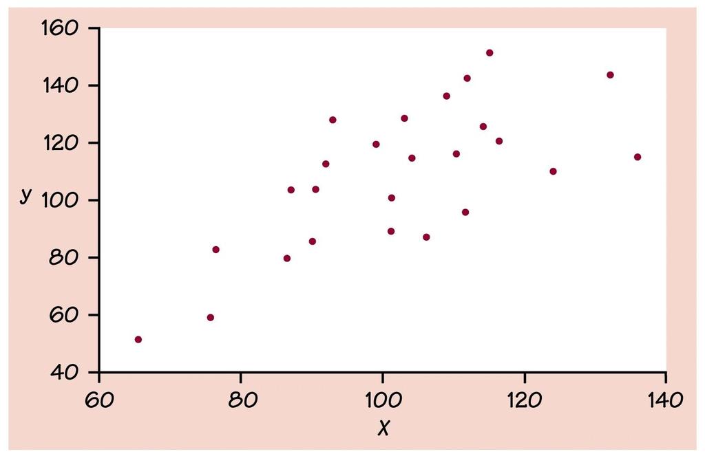
34 A. 34
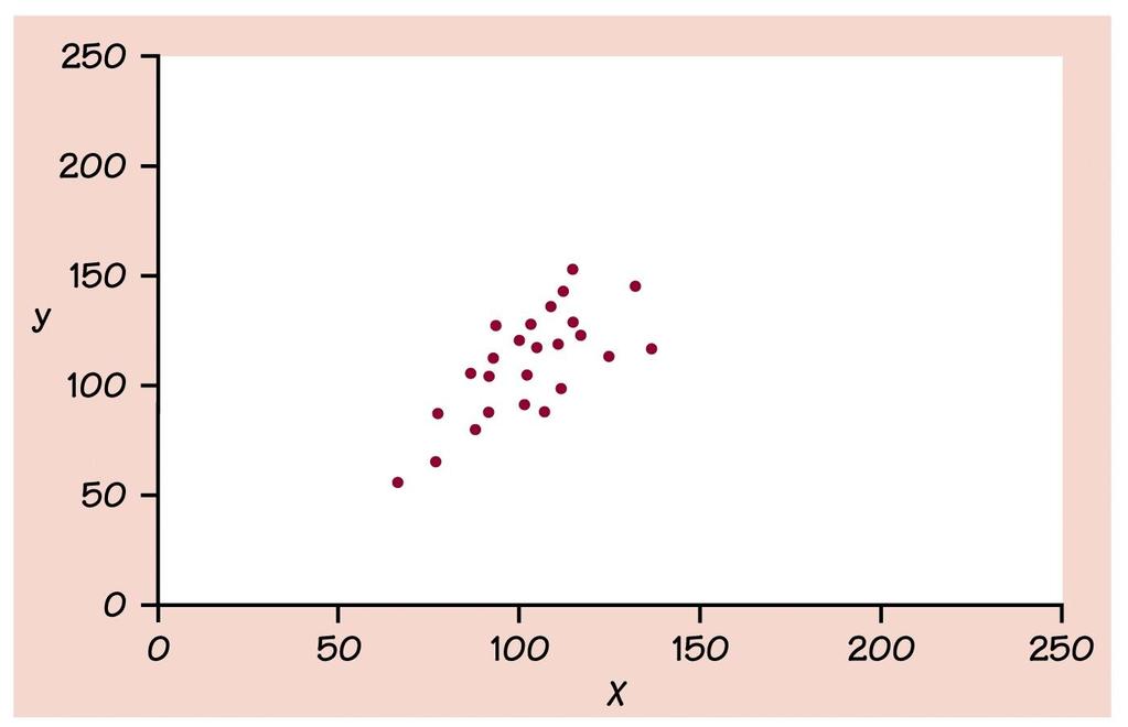
35 B. 35

36 They are the SAME, with different scales 36
37 Therefore, we have a numerical measure to analyze the strength (and direction) of a scatterplot. CORRELATION (r) 37
38 Correlation Data collected from students in Statistics classes included their heights (in inches) and weights (in pounds): Here we see a positive association and a fairly straight form, although there seems to be a high outlier.
39 How strong is the association between weight and height of Statistics students? If we had to put a number on the strength, we would not want it to depend on the units we used. Changing the units, a scatterplot of heights (in centimeters) and weights (in kilograms) doesn t change the shape of the pattern: Correlation
40 Since the units don t matter, why not remove them altogether? We could standardize both variables, z x x x y y and z y sx s y and write the coordinates of a point as (z x, z y ). Here is a scatterplot of the standardized weights and heights: Correlation
41 Correlation Note that the underlying linear pattern seems steeper in the standardized plot than in the original scatterplot. That s because we made the scales of the axes the same. Equal scaling gives a neutral way of drawing the scatterplot and a fairer impression of the strength of the association.
42 Correlation Which points in the scatterplot of z-scores give the impression of positive association? In a positive association, y increases as x increases. Some points (those in green) strengthen the impression of a positive association between height and weight. For these points, z x and z y, have the same sign, so the product z x z y is postive.
43 Correlation The points in red tend to weaken the positive association (or support a negative association). For these points, z x and z y have opposite signs. So the product z x z y is negative.
44 Correlation To turn these products into a measure of strength of association, just add up the z x z y products for every point in the scatterplot. zz x y This summarizes the direction and strength of association for all the points. If most of the points are green, the sum will tend to be positive. If most of the points are red, the sum will tend to be negative. 44
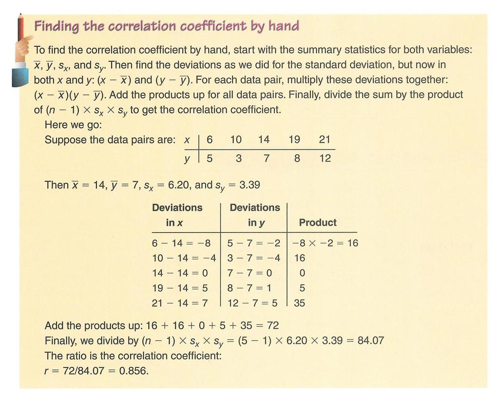
45 Correlation But the size of this sum gets bigger the more data we have. So, to adjust for this, we divide the sum by n-1. This ratio; zz x n 1 is the correlation coefficient. y 45
46 Correlation For the students heights and weights, the correlation is What does this mean in terms of strength? We ll address this shortly.
47 Correlation The correlation coefficient (r) gives us a numerical measurement of the strength of the linear relationship between the explanatory and response variables. r z x z y n 1
48 Correlation Therefore, the correlation (r) is an average of the products of the standardized x variable and the standardized y variable for n individuals. Calculate correlation (r) on the TI-83/84, automatic when calculating LSRL, must have DiagnosticOn under CATALOG function. Will discuss further in Chapter 8, Linear Regression. 48

49 Correlation Measures the strength and direction of the LINEAR relationship between two quantitative variables. Data required on variables x & y for n individuals means and standard deviations. Correlation 49
50 50
51 Correlation Conditions Correlation measures the strength of the linear association between two quantitative variables. Before you use correlation, you must check several conditions: Quantitative Variables Condition Straight Enough Condition Outlier Condition
52 Correlation Conditions Quantitative Variables Condition: Correlation applies only to quantitative variables. Don t apply correlation to categorical data masquerading as quantitative. Check that you know the variables units and what they measure.
53 Correlation Conditions Straight Enough Condition: You can calculate a correlation coefficient for any pair of variables. But correlation measures the strength only of the linear association, and will be misleading if the relationship is not linear.
54 Correlation Conditions Outlier Condition: Outliers can distort the correlation dramatically. An outlier can make an otherwise small correlation look big or hide a large correlation. It can even give an otherwise positive association a negative correlation coefficient (and vice versa). When you see an outlier, it s often a good idea to report the correlations with and without the point.
55 Correlation Properties The sign of a correlation coefficient gives the direction of the association. Correlation is always between 1 and +1. Correlation can be exactly equal to 1 or +1, but these values are unusual in real data because they mean that all the data points fall exactly on a single straight line. A correlation near zero corresponds to no linear association.
56 Correlation Properties : The magnitude of r reflects the strength of the linear association as viewed in a scatterplot. An r-value of -1 represents perfect negative correlation; r =1 represents perfect positive correlation; and r =0 represents no correlation. ( 0 r <.25 none,.25 r <.5 weak,.5 r <.75 moderate,.75 r <1 strong) 56
57 Examples Correlation: 57

58 More Examples Correlation: 58
59 Correlation Properties Correlation treats x and y symmetrically: The correlation of x with y is the same as the correlation of y with x (no distinction between explanatory and response variables). Correlation has no units (uses standardized values). Correlation is not affected by changes in the center or scale of either variable. Correlation depends only on the z-scores, and they are unaffected by changes in center or scale.
60 Correlation Properties Correlation measures the strength of the linear association between the two variables. Variables can have a strong association but still have a small correlation if the association isn t linear. Correlation is sensitive to outliers. A single outlying value can make a small correlation large or make a large one small.
61 Correlation Causation Whenever we have a strong correlation, it is tempting to explain it by imagining that the predictor variable has caused the response to help. Scatterplots and correlation coefficients never prove causation. A hidden variable that stands behind a relationship and determines it by simultaneously affecting the other two variables is called a lurking variable.
62 Correlation Causation Lurking variable: A variable that is not explicitly part of a study but affects the way the variables in the study appear to be related. A variable, usually unobserved, that influences the association between the variables of primary interest. Because we can never be certain that observational data are not hiding a lurking variable, it is never safe to conclude that a scatterplot demonstrates a cause-andeffect relationship, no matter how strong the correlation. 62
63 Correlation Causation Scatterplots and correlation coefficients never prove causation. That s the reason it took so long for the US Surgeon General to get warning labels on cigarettes. Although there was plenty of evidence that increased smoking was associated with lung cancer, it took years to provide evidence that smoking actually causes lung cancer. Because it is so important, we will repeat it: A scatterplot or correlation alone cannot prove causation. 63
64 Correlation Tables It is common in some fields to compute the correlations between each pair of variables in a collection of variables and arrange these correlations in a table.

65 Correlation Tables Correlation tables are compact and give a lot of summary information at a glance. They can be an efficient way to look at large data sets, but also a dangerous one. By presenting all these correlations without any checks for linearity and outliers, the correlation table risks showing misleading or meaningless information due to hidden outliers or a nonlinear form.
66 Straightening Scatterplots Straight line relationships are the ones that we can measure with correlation. When a scatterplot shows a bent form that consistently increases or decreases, we can often straighten the form of the plot by re-expressing one or both variables.
67 Straightening Scatterplots A scatterplot of f/stop vs. shutter speed shows a bent relationship:
68 Straightening Scatterplots Re-expressing f/stop vs. shutter speed by squaring the f/stop values straightens the relationship:
69 What Can Go Wrong? Don t say correlation when you mean association. More often than not, people say correlation when they mean association. The word correlation should be reserved for measuring the strength and direction of the linear relationship between two quantitative variables.
70 What Can Go Wrong? Don t correlate categorical variables. Be sure to check the Quantitative Variables Condition. Don t confuse correlation with causation. Scatterplots and correlations never demonstrate causation. These statistical tools can only demonstrate an association between variables.
71 What Can Go Wrong? Be sure the association is linear. There may be a strong association between two variables that have a nonlinear association.
72 What Can Go Wrong? Don t assume the relationship is linear just because the correlation coefficient is high. Here the correlation is 0.979, but the relationship is actually bent.
73 What Can Go Wrong? Beware of outliers. Even a single outlier can dominate the correlation value. Make sure to check the Outlier Condition.
74 What have we learned? We examine scatterplots for direction, form, strength, and unusual features. Although not every relationship is linear, when the scatterplot is straight enough, the correlation coefficient is a useful numerical summary. The sign of the correlation tells us the direction of the association. The magnitude of the correlation tells us the strength of a linear association. Correlation has no units, so shifting or scaling the data, standardizing, or swapping the variables has no effect on the numerical value.
75 What have we learned? Doing Statistics right means that we have to Think about whether our choice of methods is appropriate. Before finding or talking about a correlation, check the Straight Enough Condition. Watch out for outliers! Don t assume that a high correlation or strong association is evidence of a cause-and-effect relationship beware of lurking variables!
76 Assignment Exercises pg : #3, 5, 6, 11, 12, 14, 15, 16, 20, 23, 27, 28 Read Ch-8, pg
Chapter 7. Scatterplots, Association, and Correlation. Copyright 2010 Pearson Education, Inc.
 Chapter 7 Scatterplots, Association, and Correlation Copyright 2010 Pearson Education, Inc. Looking at Scatterplots Scatterplots may be the most common and most effective display for data. In a scatterplot,
Chapter 7 Summary Scatterplots, Association, and Correlation
 Chapter 7 Summary Scatterplots, Association, and Correlation What have we learned? We examine scatterplots for direction, form, strength, and unusual features. Although not every relationship is linear,
Chapter 6. September 17, Please pick up a calculator and take out paper and something to write with. Association and Correlation.
 Please pick up a calculator and take out paper and something to write with. Sep 17 8:08 AM Chapter 6 Scatterplots, Association and Correlation Copyright 2015, 2010, 2007 Pearson Education, Inc. Chapter
STA Module 5 Regression and Correlation. Learning Objectives. Learning Objectives (Cont.) Upon completing this module, you should be able to:
 Upon completing this module, you should be able to:") STA 2023 Module 5 Regression and Correlation Learning Objectives Upon completing this module, you should be able to: 1. Define and apply the concepts related to linear equations with one independent variable.
STA 2023 Module 5 Regression and Correlation Learning Objectives Upon completing this module, you should be able to: 1. Define and apply the concepts related to linear equations with one independent variable.
appstats8.notebook October 11, 2016
 Chapter 8 Linear Regression Objective: Students will construct and analyze a linear model for a given set of data. Fat Versus Protein: An Example pg 168 The following is a scatterplot of total fat versus
Announcement. Student Opinion of Courses and Teaching (SOCT) forms will be available for you during the dates indicated:
 forms will be available for you during the dates indicated:") Announcement Student Opinion of Courses and Teaching (SOCT) forms will be available for you during the dates indicated: STT 315 023: 4/14/2014-5/2/2014(SOCT only) STT 315 024: 4/14/2014-5/2/2014 (SOCT
Announcement Student Opinion of Courses and Teaching (SOCT) forms will be available for you during the dates indicated: STT 315 023: 4/14/2014-5/2/2014(SOCT only) STT 315 024: 4/14/2014-5/2/2014 (SOCT
Chapter 8. Linear Regression. The Linear Model. Fat Versus Protein: An Example. The Linear Model (cont.) Residuals
 Residuals") Chapter 8 Linear Regression Copyright 2007 Pearson Education, Inc. Publishing as Pearson Addison-Wesley Slide 8-1 Copyright 2007 Pearson Education, Inc. Publishing as Pearson Addison-Wesley Fat Versus
Chapter 8 Linear Regression Copyright 2007 Pearson Education, Inc. Publishing as Pearson Addison-Wesley Slide 8-1 Copyright 2007 Pearson Education, Inc. Publishing as Pearson Addison-Wesley Fat Versus
Chapter 8. Linear Regression. Copyright 2010 Pearson Education, Inc.
 Chapter 8 Linear Regression Copyright 2010 Pearson Education, Inc. Fat Versus Protein: An Example The following is a scatterplot of total fat versus protein for 30 items on the Burger King menu: Copyright
AP Statistics S C A T T E R P L O T S, A S S O C I A T I O N, A N D C O R R E L A T I O N C H A P 6
 AP Statistics 1 S C A T T E R P L O T S, A S S O C I A T I O N, A N D C O R R E L A T I O N C H A P 6 The invalid assumption that correlation implies cause is probably among the two or three most serious
Linear Regression. Linear Regression. Linear Regression. Did You Mean Association Or Correlation?
 Did You Mean Association Or Correlation? AP Statistics Chapter 8 Be careful not to use the word correlation when you really mean association. Often times people will incorrectly use the word correlation
appstats27.notebook April 06, 2017
 Chapter 27 Objective Students will conduct inference on regression and analyze data to write a conclusion. Inferences for Regression An Example: Body Fat and Waist Size pg 634 Our chapter example revolves
Describing Bivariate Relationships
 Describing Bivariate Relationships Bivariate Relationships What is Bivariate data? When exploring/describing a bivariate (x,y) relationship: Determine the Explanatory and Response variables Plot the data
5.1 Bivariate Relationships
 Chapter 5 Summarizing Bivariate Data Source: TPS 5.1 Bivariate Relationships What is Bivariate data? When exploring/describing a bivariate (x,y) relationship: Determine the Explanatory and Response variables
Bivariate Data Summary
 Bivariate Data Summary Bivariate data data that examines the relationship between two variables What individuals to the data describe? What are the variables and how are they measured Are the variables
1. Create a scatterplot of this data. 2. Find the correlation coefficient.
 How Fast Foods Compare Company Entree Total Calories Fat (grams) McDonald s Big Mac 540 29 Filet o Fish 380 18 Burger King Whopper 670 40 Big Fish Sandwich 640 32 Wendy s Single Burger 470 21 1. Create
Chapter 8. Linear Regression /71
 Chapter 8 Linear Regression 1 /71 Homework p192 1, 2, 3, 5, 7, 13, 15, 21, 27, 28, 29, 32, 35, 37 2 /71 3 /71 Objectives Determine Least Squares Regression Line (LSRL) describing the association of two
Chapter 3: Examining Relationships
 Chapter 3: Examining Relationships Most statistical studies involve more than one variable. Often in the AP Statistics exam, you will be asked to compare two data sets by using side by side boxplots or
Important note: Transcripts are not substitutes for textbook assignments. 1
 In this lesson we will cover correlation and regression, two really common statistical analyses for quantitative (or continuous) data. Specially we will review how to organize the data, the importance
Chapter 27 Summary Inferences for Regression
 Chapter 7 Summary Inferences for Regression What have we learned? We have now applied inference to regression models. Like in all inference situations, there are conditions that we must check. We can test
BIVARIATE DATA data for two variables
 (Chapter 3) BIVARIATE DATA data for two variables INVESTIGATING RELATIONSHIPS We have compared the distributions of the same variable for several groups, using double boxplots and back-to-back stemplots.
3.1 Scatterplots and Correlation
 3.1 Scatterplots and Correlation Most statistical studies examine data on more than one variable. In many of these settings, the two variables play different roles. Explanatory variable (independent) predicts
Scatterplots and Correlation
 Bivariate Data Page 1 Scatterplots and Correlation Essential Question: What is the correlation coefficient and what does it tell you? Most statistical studies examine data on more than one variable. Fortunately,
CHAPTER 3 Describing Relationships
 CHAPTER 3 Describing Relationships 3.1 Scatterplots and Correlation The Practice of Statistics, 5th Edition Starnes, Tabor, Yates, Moore Bedford Freeman Worth Publishers Scatterplots and Correlation Learning
Nov 13 AP STAT. 1. Check/rev HW 2. Review/recap of notes 3. HW: pg #5,7,8,9,11 and read/notes pg smartboad notes ch 3.
 Nov 13 AP STAT 1. Check/rev HW 2. Review/recap of notes 3. HW: pg 179 184 #5,7,8,9,11 and read/notes pg 185 188 1 Chapter 3 Notes Review Exploring relationships between two variables. BIVARIATE DATA Is
Scatterplots. 3.1: Scatterplots & Correlation. Scatterplots. Explanatory & Response Variables. Section 3.1 Scatterplots and Correlation
 3.1: Scatterplots & Correlation Scatterplots A scatterplot shows the relationship between two quantitative variables measured on the same individuals. The values of one variable appear on the horizontal
Basic Practice of Statistics 7th
 Basic Practice of Statistics 7th Edition Lecture PowerPoint Slides In Chapter 4, we cover Explanatory and response variables Displaying relationships: Scatterplots Interpreting scatterplots Adding categorical
If the roles of the variable are not clear, then which variable is placed on which axis is not important.
 Chapter 6 - Scatterplots, Association, and Correlation February 6, 2015 In chapter 6-8, we look at ways to compare the relationship of 2 quantitative variables. First we will look at a graphical representation,
Warm-up Using the given data Create a scatterplot Find the regression line
 Time at the lunch table Caloric intake 21.4 472 30.8 498 37.7 335 32.8 423 39.5 437 22.8 508 34.1 431 33.9 479 43.8 454 42.4 450 43.1 410 29.2 504 31.3 437 28.6 489 32.9 436 30.6 480 35.1 439 33.0 444
Looking at Data Relationships. 2.1 Scatterplots W. H. Freeman and Company
 Looking at Data Relationships 2.1 Scatterplots 2012 W. H. Freeman and Company Here, we have two quantitative variables for each of 16 students. 1) How many beers they drank, and 2) Their blood alcohol
Chapter 18. Sampling Distribution Models. Copyright 2010, 2007, 2004 Pearson Education, Inc.
 Chapter 18 Sampling Distribution Models Copyright 2010, 2007, 2004 Pearson Education, Inc. Normal Model When we talk about one data value and the Normal model we used the notation: N(μ, σ) Copyright 2010,
AP Statistics. Chapter 9 Re-Expressing data: Get it Straight
 AP Statistics Chapter 9 Re-Expressing data: Get it Straight Objectives: Re-expression of data Ladder of powers Straight to the Point We cannot use a linear model unless the relationship between the two
Relationships Regression
 Relationships Regression BPS chapter 5 2006 W.H. Freeman and Company Objectives (BPS chapter 5) Regression Regression lines The least-squares regression line Using technology Facts about least-squares
Chapter 14. Statistical versus Deterministic Relationships. Distance versus Speed. Describing Relationships: Scatterplots and Correlation
 Chapter 14 Describing Relationships: Scatterplots and Correlation Chapter 14 1 Statistical versus Deterministic Relationships Distance versus Speed (when travel time is constant). Income (in millions of
Chapter 7. Scatterplots, Association, and Correlation. Scatterplots & Correlation. Scatterplots & Correlation. Stat correlation
 Chapter 7 Scatterplots, Association, and Correlation 1 Scatterplots & Correlation Here, we see a positive relationship between a bear s age and its neck diameter. As a bear gets older, it tends to have
Chapter 1 Review of Equations and Inequalities
 Chapter 1 Review of Equations and Inequalities Part I Review of Basic Equations Recall that an equation is an expression with an equal sign in the middle. Also recall that, if a question asks you to solve
THE PEARSON CORRELATION COEFFICIENT
 CORRELATION Two variables are said to have a relation if knowing the value of one variable gives you information about the likely value of the second variable this is known as a bivariate relation There
Big Data Analysis with Apache Spark UC#BERKELEY
 Big Data Analysis with Apache Spark UC#BERKELEY This Lecture: Relation between Variables An association A trend» Positive association or Negative association A pattern» Could be any discernible shape»
6.1.1 How can I make predictions?
 CCA Ch 6: Modeling Two-Variable Data Name: Team: 6.1.1 How can I make predictions? Line of Best Fit 6-1. a. Length of tube: Diameter of tube: Distance from the wall (in) Width of field of view (in) b.
AP STATISTICS Name: Period: Review Unit IV Scatterplots & Regressions
 AP STATISTICS Name: Period: Review Unit IV Scatterplots & Regressions Know the definitions of the following words: bivariate data, regression analysis, scatter diagram, correlation coefficient, independent
Linear Regression and Correlation. February 11, 2009
 Linear Regression and Correlation February 11, 2009 The Big Ideas To understand a set of data, start with a graph or graphs. The Big Ideas To understand a set of data, start with a graph or graphs. If
Biostatistics: Correlations
 Biostatistics: s One of the most common errors we find in the press is the confusion between correlation and causation in scientific and health-related studies. In theory, these are easy to distinguish
Chapter 7 Linear Regression
 Chapter 7 Linear Regression 1 7.1 Least Squares: The Line of Best Fit 2 The Linear Model Fat and Protein at Burger King The correlation is 0.76. This indicates a strong linear fit, but what line? The line
Unit 6 - Introduction to linear regression
 Unit 6 - Introduction to linear regression Suggested reading: OpenIntro Statistics, Chapter 7 Suggested exercises: Part 1 - Relationship between two numerical variables: 7.7, 7.9, 7.11, 7.13, 7.15, 7.25,
Relationships between variables. Association Examples: Smoking is associated with heart disease. Weight is associated with height.
 Relationships between variables. Association Examples: Smoking is associated with heart disease. Weight is associated with height. Income is associated with education. Functional relationships between
Related Example on Page(s) R , 148 R , 148 R , 156, 157 R3.1, R3.2. Activity on 152, , 190.
 R , 148 R , 148 R , 156, 157 R3.1, R3.2. Activity on 152, , 190.") Name Chapter 3 Learning Objectives Identify explanatory and response variables in situations where one variable helps to explain or influences the other. Make a scatterplot to display the relationship
Name Chapter 3 Learning Objectives Identify explanatory and response variables in situations where one variable helps to explain or influences the other. Make a scatterplot to display the relationship
Probability Distributions
 CONDENSED LESSON 13.1 Probability Distributions In this lesson, you Sketch the graph of the probability distribution for a continuous random variable Find probabilities by finding or approximating areas
AP Stats ~ 3A: Scatterplots and Correlation OBJECTIVES:
 OBJECTIVES: IDENTIFY explanatory and response variables in situations where one variable helps to explain or influences the other. MAKE a scatterplot to display the relationship between two quantitative
9. Linear Regression and Correlation
 9. Linear Regression and Correlation Data: y a quantitative response variable x a quantitative explanatory variable (Chap. 8: Recall that both variables were categorical) For example, y = annual income,
Correlation A relationship between two variables As one goes up, the other changes in a predictable way (either mostly goes up or mostly goes down)
") Two-Variable Statistics Correlation A relationship between two variables As one goes up, the other changes in a predictable way (either mostly goes up or mostly goes down) Positive Correlation As one variable
Two-Variable Statistics Correlation A relationship between two variables As one goes up, the other changes in a predictable way (either mostly goes up or mostly goes down) Positive Correlation As one variable
Chapter 5 Least Squares Regression
 Chapter 5 Least Squares Regression A Royal Bengal tiger wandered out of a reserve forest. We tranquilized him and want to take him back to the forest. We need an idea of his weight, but have no scale!
Example: Can an increase in non-exercise activity (e.g. fidgeting) help people gain less weight?
 help people gain less weight?") Example: Can an increase in non-exercise activity (e.g. fidgeting) help people gain less weight? 16 subjects overfed for 8 weeks Explanatory: change in energy use from non-exercise activity (calories)
Example: Can an increase in non-exercise activity (e.g. fidgeting) help people gain less weight? 16 subjects overfed for 8 weeks Explanatory: change in energy use from non-exercise activity (calories)
Correlation and regression
 NST 1B Experimental Psychology Statistics practical 1 Correlation and regression Rudolf Cardinal & Mike Aitken 11 / 12 November 2003 Department of Experimental Psychology University of Cambridge Handouts:
Analysing data: regression and correlation S6 and S7
 Basic medical statistics for clinical and experimental research Analysing data: regression and correlation S6 and S7 K. Jozwiak k.jozwiak@nki.nl 2 / 49 Correlation So far we have looked at the association
STA Why Sampling? Module 6 The Sampling Distributions. Module Objectives
 STA 2023 Module 6 The Sampling Distributions Module Objectives In this module, we will learn the following: 1. Define sampling error and explain the need for sampling distributions. 2. Recognize that sampling
Chapter 7. Scatterplots, Association, and Correlation
 Chapter 7 Scatterplots, Association, and Correlation Bin Zou (bzou@ualberta.ca) STAT 141 University of Alberta Winter 2015 1 / 29 Objective In this chapter, we study relationships! Instead, we investigate
Scatterplots and Correlations
 Scatterplots and Correlations Section 4.1 1 New Definitions Explanatory Variable: (independent, x variable): attempts to explain observed outcome. Response Variable: (dependent, y variable): measures outcome
t-test for b Copyright 2000 Tom Malloy. All rights reserved. Regression
 t-test for b Copyright 2000 Tom Malloy. All rights reserved. Regression Recall, back some time ago, we used a descriptive statistic which allowed us to draw the best fit line through a scatter plot. We
AP Statistics L I N E A R R E G R E S S I O N C H A P 7
 AP Statistics 1 L I N E A R R E G R E S S I O N C H A P 7 The object [of statistics] is to discover methods of condensing information concerning large groups of allied facts into brief and compendious
LECTURE 15: SIMPLE LINEAR REGRESSION I
 David Youngberg BSAD 20 Montgomery College LECTURE 5: SIMPLE LINEAR REGRESSION I I. From Correlation to Regression a. Recall last class when we discussed two basic types of correlation (positive and negative).
AP Statistics Two-Variable Data Analysis
 AP Statistics Two-Variable Data Analysis Key Ideas Scatterplots Lines of Best Fit The Correlation Coefficient Least Squares Regression Line Coefficient of Determination Residuals Outliers and Influential
Recall, Positive/Negative Association:
 ANNOUNCEMENTS: Remember that discussion today is not for credit. Go over R Commander. Go to 192 ICS, except at 4pm, go to 192 or 174 ICS. TODAY: Sections 5.3 to 5.5. Note this is a change made in the daily
Lecture 4 Scatterplots, Association, and Correlation
 Lecture 4 Scatterplots, Association, and Correlation Previously, we looked at Single variables on their own One or more categorical variable In this lecture: We shall look at two quantitative variables.
Lecture 4 Scatterplots, Association, and Correlation
 Lecture 4 Scatterplots, Association, and Correlation Previously, we looked at Single variables on their own One or more categorical variables In this lecture: We shall look at two quantitative variables.
SCATTERPLOTS. We can talk about the correlation or relationship or association between two variables and mean the same thing.
 SCATTERPLOTS When we want to know if there is some sort of relationship between 2 numerical variables, we can use a scatterplot. It gives a visual display of the relationship between the 2 variables. Graphing
AP Statistics Unit 6 Note Packet Linear Regression. Scatterplots and Correlation
 Scatterplots and Correlation Name Hr A scatterplot shows the relationship between two quantitative variables measured on the same individuals. variable (y) measures an outcome of a study variable (x) may
Chapter 3: Describing Relationships
 Chapter 3: Describing Relationships Section 3.2 The Practice of Statistics, 4 th edition For AP* STARNES, YATES, MOORE Chapter 3 Describing Relationships 3.1 Scatterplots and Correlation 3.2 Section 3.2
Chapter 3: Describing Relationships
 Chapter 3: Describing Relationships Section 3.2 The Practice of Statistics, 4 th edition For AP* STARNES, YATES, MOORE Chapter 3 Describing Relationships 3.1 Scatterplots and Correlation 3.2 Section 3.2
Correlation: basic properties.
 Correlation: basic properties. 1 r xy 1 for all sets of paired data. The closer r xy is to ±1, the stronger the linear relationship between the x-data and y-data. If r xy = ±1 then there is a perfect linear
Chapter 6 The Standard Deviation as a Ruler and the Normal Model
 Chapter 6 The Standard Deviation as a Ruler and the Normal Model Overview Key Concepts Understand how adding (subtracting) a constant or multiplying (dividing) by a constant changes the center and/or spread
Chapter 5 Friday, May 21st
 Chapter 5 Friday, May 21 st Overview In this Chapter we will see three different methods we can use to describe a relationship between two quantitative variables. These methods are: Scatterplot Correlation
Objectives. 2.3 Least-squares regression. Regression lines. Prediction and Extrapolation. Correlation and r 2. Transforming relationships
 Objectives 2.3 Least-squares regression Regression lines Prediction and Extrapolation Correlation and r 2 Transforming relationships Adapted from authors slides 2012 W.H. Freeman and Company Straight Line
Module 03 Lecture 14 Inferential Statistics ANOVA and TOI
 Introduction of Data Analytics Prof. Nandan Sudarsanam and Prof. B Ravindran Department of Management Studies and Department of Computer Science and Engineering Indian Institute of Technology, Madras Module
Arvind Borde / MAT , Week 5: Relationships I
 Arvind Borde / MAT 19.001, Week 5: Relationships I 1 Review of Standard Deviation Population (N observations) Sample (sample size n) (xi µ) σ = (xi x) s = N n 1 µ = mean x = mean Where are most of the
HOLLOMAN S AP STATISTICS BVD CHAPTER 08, PAGE 1 OF 11. Figure 1 - Variation in the Response Variable
 Chapter 08: Linear Regression There are lots of ways to model the relationships between variables. It is important that you not think that what we do is the way. There are many paths to the summit We are
Regression, part II. I. What does it all mean? A) Notice that so far all we ve done is math.
 Notice that so far all we ve done is math.") Regression, part II I. What does it all mean? A) Notice that so far all we ve done is math. 1) One can calculate the Least Squares Regression Line for anything, regardless of any assumptions. 2) But, if
Regression, part II I. What does it all mean? A) Notice that so far all we ve done is math. 1) One can calculate the Least Squares Regression Line for anything, regardless of any assumptions. 2) But, if
Scatterplots. STAT22000 Autumn 2013 Lecture 4. What to Look in a Scatter Plot? Form of an Association
 Scatterplots STAT22000 Autumn 2013 Lecture 4 Yibi Huang October 7, 2013 21 Scatterplots 22 Correlation (x 1, y 1 ) (x 2, y 2 ) (x 3, y 3 ) (x n, y n ) A scatter plot shows the relationship between two
MATH 1070 Introductory Statistics Lecture notes Relationships: Correlation and Simple Regression
 MATH 1070 Introductory Statistics Lecture notes Relationships: Correlation and Simple Regression Objectives: 1. Learn the concepts of independent and dependent variables 2. Learn the concept of a scatterplot
Scatterplots and Correlation
 Chapter 4 Scatterplots and Correlation 2/15/2019 Chapter 4 1 Explanatory Variable and Response Variable Correlation describes linear relationships between quantitative variables X is the quantitative explanatory
Unit 6 - Simple linear regression
 Sta 101: Data Analysis and Statistical Inference Dr. Çetinkaya-Rundel Unit 6 - Simple linear regression LO 1. Define the explanatory variable as the independent variable (predictor), and the response variable
The response variable depends on the explanatory variable.
 A response variable measures an outcome of study. > dependent variables An explanatory variable attempts to explain the observed outcomes. > independent variables The response variable depends on the explanatory
Lecture 3. The Population Variance. The population variance, denoted σ 2, is the sum. of the squared deviations about the population
 Lecture 5 1 Lecture 3 The Population Variance The population variance, denoted σ 2, is the sum of the squared deviations about the population mean divided by the number of observations in the population,
Chapter 6: Exploring Data: Relationships Lesson Plan
 Chapter 6: Exploring Data: Relationships Lesson Plan For All Practical Purposes Displaying Relationships: Scatterplots Mathematical Literacy in Today s World, 9th ed. Making Predictions: Regression Line
Regression and correlation. Correlation & Regression, I. Regression & correlation. Regression vs. correlation. Involve bivariate, paired data, X & Y
 Regression and correlation Correlation & Regression, I 9.07 4/1/004 Involve bivariate, paired data, X & Y Height & weight measured for the same individual IQ & exam scores for each individual Height of
The following are generally referred to as the laws or rules of exponents. x a x b = x a+b (5.1) 1 x b a (5.2) (x a ) b = x ab (5.
 1 x b a (5.2) (x a ) b = x ab (5.") Chapter 5 Exponents 5. Exponent Concepts An exponent means repeated multiplication. For instance, 0 6 means 0 0 0 0 0 0, or,000,000. You ve probably noticed that there is a logical progression of operations.
Chapter 5 Exponents 5. Exponent Concepts An exponent means repeated multiplication. For instance, 0 6 means 0 0 0 0 0 0, or,000,000. You ve probably noticed that there is a logical progression of operations.
The following formulas related to this topic are provided on the formula sheet:
 Student Notes Prep Session Topic: Exploring Content The AP Statistics topic outline contains a long list of items in the category titled Exploring Data. Section D topics will be reviewed in this session.
1) A residual plot: A)
 A residual plot: A)") 1) A residual plot: A) B) C) D) E) displays residuals of the response variable versus the independent variable. displays residuals of the independent variable versus the response variable. displays residuals
1) A residual plot: A) B) C) D) E) displays residuals of the response variable versus the independent variable. displays residuals of the independent variable versus the response variable. displays residuals
HOMEWORK (due Wed, Jan 23): Chapter 3: #42, 48, 74
: Chapter 3: #42, 48, 74") ANNOUNCEMENTS: Grades available on eee for Week 1 clickers, Quiz and Discussion. If your clicker grade is missing, check next week before contacting me. If any other grades are missing let me know now.
ANNOUNCEMENTS: Grades available on eee for Week 1 clickers, Quiz and Discussion. If your clicker grade is missing, check next week before contacting me. If any other grades are missing let me know now.
Wed, June 26, (Lecture 8-2). Nonlinearity. Significance test for correlation R-squared, SSE, and SST. Correlation in SPSS.
. Nonlinearity. Significance test for correlation R-squared, SSE, and SST. Correlation in SPSS.") Wed, June 26, (Lecture 8-2). Nonlinearity. Significance test for correlation R-squared, SSE, and SST. Correlation in SPSS. Last time, we looked at scatterplots, which show the interaction between two variables,
Wed, June 26, (Lecture 8-2). Nonlinearity. Significance test for correlation R-squared, SSE, and SST. Correlation in SPSS. Last time, we looked at scatterplots, which show the interaction between two variables,
Relationships between variables. Visualizing Bivariate Distributions: Scatter Plots
 SFBS Course Notes Part 7: Correlation Bivariate relationships (p. 1) Linear transformations (p. 3) Pearson r : Measuring a relationship (p. 5) Interpretation of correlations (p. 10) Relationships between
4.1 Introduction. 4.2 The Scatter Diagram. Chapter 4 Linear Correlation and Regression Analysis
 4.1 Introduction Correlation is a technique that measures the strength (or the degree) of the relationship between two variables. For example, we could measure how strong the relationship is between people
Regression, Part I. - In correlation, it would be irrelevant if we changed the axes on our graph.
 Regression, Part I I. Difference from correlation. II. Basic idea: A) Correlation describes the relationship between two variables, where neither is independent or a predictor. - In correlation, it would
a. Length of tube: Diameter of tube:
 CCA Ch 6: Modeling Two-Variable Data Name: 6.1.1 How can I make predictions? Line of Best Fit 6-1. a. Length of tube: Diameter of tube: Distance from the wall (in) Width of field of view (in) b. Make a
Linear Regression Communication, skills, and understanding Calculator Use
 Linear Regression Communication, skills, and understanding Title, scale and label the horizontal and vertical axes Comment on the direction, shape (form), and strength of the relationship and unusual features
The First Derivative Test
 The First Derivative Test We have already looked at this test in the last section even though we did not put a name to the process we were using. We use a y number line to test the sign of the first derivative
Chapter 6 Scatterplots, Association and Correlation
 Chapter 6 Scatterplots, Association and Correlation Looking for Correlation Example Does the number of hours you watch TV per week impact your average grade in a class? Hours 12 10 5 3 15 16 8 Grade 70
1 Least Squares Estimation - multiple regression.
 Introduction to multiple regression. Fall 2010 1 Least Squares Estimation - multiple regression. Let y = {y 1,, y n } be a n 1 vector of dependent variable observations. Let β = {β 0, β 1 } be the 2 1
Finite Mathematics : A Business Approach
 Finite Mathematics : A Business Approach Dr. Brian Travers and Prof. James Lampes Second Edition Cover Art by Stephanie Oxenford Additional Editing by John Gambino Contents What You Should Already Know
Objectives. 2.1 Scatterplots. Scatterplots Explanatory and response variables. Interpreting scatterplots Outliers
 Objectives 2.1 Scatterplots Scatterplots Explanatory and response variables Interpreting scatterplots Outliers Adapted from authors slides 2012 W.H. Freeman and Company Relationships A very important aspect
9 Correlation and Regression
 9 Correlation and Regression SW, Chapter 12. Suppose we select n = 10 persons from the population of college seniors who plan to take the MCAT exam. Each takes the test, is coached, and then retakes the
Sampling Distribution Models. Chapter 17
 Sampling Distribution Models Chapter 17 Objectives: 1. Sampling Distribution Model 2. Sampling Variability (sampling error) 3. Sampling Distribution Model for a Proportion 4. Central Limit Theorem 5. Sampling